In the last part of this Excel Design series I offered some basic tips so you could avoid the most common Excel spreadsheet design horrors.
Spreadsheet design is not just about aesthetics, usability is an important aspect to take into account as well. If you are creating spreadsheets for other people to use then you absolutely need to make your spreadsheets easy to use. For a start, you don’t want filling out your sheets to be more of a chore than they need to be, but also to prevent data entry errors.
For this article I turned to an Excel expert, Debra Dalgleish, who is an independent computer consultant who specializes in Microsoft Office programming and development. As well as being awarded the Microsoft Office Excel MVP award each year since 2001, Debra is the author of three brilliant Excel books.
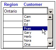
 Many data entry errors can be avoided by reducing the amount of actual typing, or decision making on the part of the of the person doing the inputting. Debra recommends “Create data validation drop down lists so users can select a valid item instead of typing.”
- “Use colour only as a guide for users. For example, type data in light blue cells and select from a list in light green cells.”
- Consider also the readability of your spreadsheet when printed. “In the Page Setup dialog box, on the Sheet tab, add a check mark to ‘Black and white’. If a user prints the sheet, it will be easier to read, and will use less toner”.
- Another printing tip that I snatched from Debra’s site is to selectively turn off cells when printing.
- I asked Debra about her use of images in spreadsheets. Many people seem divided on if they add or detract from a layout. “I will sometimes add a client’s logo on a report that will be printed, or on their data entry page but I will rarely use any other pictures.”
- You can shade alternating rows to make dense tables figures more readable using conditional formatting.
- Click the Select All button, above the Row 1 button, to select all the cells on the worksheet.
- Choose Format|Conditional Formatting
- From the first dropdown, choose Formula Is
- For the formula, enter =MOD(ROW(),2)
- Click the Format button.
- On the Patterns tab, select a colour for shading
- Click OK, click OK
- Debra recommends you use lines and borders sparingly, and to choose appropriate line colours. “In a data entry form I’d use lines as borders around data entry cells, in addition to colour in the cells. If the data entry form is long, lines would separate the sections. In a report I’d use lines to separate the totals from the report body. For separating data in a long list, white space is preferable, but if lines are necessary I’d use grey, instead of black.”
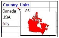
 Here’s a nice trick Debra uses for adding a picture to a comment which keeps the sheet from looking cluttered
- Right-click the cell which contains the comment.
- Choose Show/Hide Comments, and clear any text from the comment.
- Click on the border of the comment, to select it.
- Choose Format|Comment
- On the Colors and Lines tab, click the drop-down arrow for Color.
- Click Fill Effects
- On the picture tab, click Select Picture
- Locate and select the picture
- To keep the picture in proportion, add a check mark to Lock Picture Aspect Ratio
- Click Insert, click OK, click OK
I certainly learned a lot from Debra and I hope you did too! Be sure to check out Debra’s blog for more Office tips.


