Thing is, spreadsheets are a tool for creating content to be read also. In fact, I would go as far as to say a spreadsheet is an influential tool of persuasion, when used correctly.
On top of that, many business rely on Excel for their business forms, such as invoices, expenses, time sheets and all kinds of paperwork.
It is possible to not only have your spreadsheets make you more productive, but also look good.
In this series I want to show you how you can beautify your spreadsheets without requiring any real design skills.
Formatting Reports With Spreadsheets
Although the features available in the latest software surpass anything that came before, this use of spreadsheets is not a new thing, can you remember the old Lotus 123 and Supercalc days?
Even back then, spreadsheets were used to make data more presentable, more professional, and less, well, like it had come straight off a music-ruled dotmatrix report, which was often the main alternative.
Of course back then a lot of the data was retyped, causing inevitable transcription errors. Now Excel can read in data exported from numerous systems natively, and also understand common open formats, even down to interrogating live databases directly through ODBC.
So this is not just about spreadsheets you create form scratch, Excels presentation abilities can help you with presenting any kind of data that Excel can import.
Things have come a long way. In the past you were pretty much restricted to having lines, boxes, bold and italic. If you were lucky. Now Excel has features only previously found in desk top publishing packages.
Excel’s graphic features are both a blessing and a curse.
Yes, you have a huge amount of freedom and functionality to create the look you want, but the downside is a lot of people over use these features and make their spreadsheets look like a Nascar, and reports appear to be a page from a comic book.
Let’s focus on some basics!
10 Tips for Avoiding Excel Formatting Horrors
Excel Design Tip 1: Less is More
When working with the formatting and design features of Excel please do not treat it like a kid in a candy store!
Restraint is important if you want to provide the best possible result.
Excel Design Tip 2: Comic Sans has no place in business
Sometimes I wish I could build a time machine so I could go back to whichever lunatic was presiding over the meeting when Microsoft decided to bundle Comic Sans with their operating system and give them a sound thrashing.
Ahem.
If there is one thing that will reduce the professionalism of your spreadsheet it is the inclusion of any kind of comic font, but in particular Comic Sans. Just don’t.
Excel Design Tip 3: WordArt can kill your design
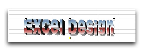
WordArt is a nice and flexible feature that has been an addition of Office for years. Many people are comfortable with it. But does it ever look cheesy! Just look at the header image of this article – geeky, no?
You know where we agreed restraint was important a few paragraphs ago? That goes one hundred fold for when using WordArt. In fact, if in doubt, leave it out!
Excel Design Tip 4: Clipart Clichés
Photography or illustration can bring a page to life and stop it being a sea of text and numbers, but if the clipart looks over-used, out of place, hackneyed or just plain BAD, then you are only doing damage. I would recommend instead of the default clipart to look to outside sources such as Istockphoto, but there is a similar risk in using those also!
Excel Design Tip 5: Careful with colors
Color is essential in aiding clarity of your data, providing of course you are going to view the spreadsheet on screen or your printer can output color. What often happens though is people get carried away and the end 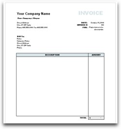 result is a rainbow mess of clashing, garish, neon. Excel is not the best at allowing color flexibility, so make the best of a bad set of colors by selecting muted tones that go well together, such as grays and blues.
Excel Design Tip 6: Templates are your friend
Rather than starting from scratch, especially if you are design challenged like me, consider trying one of the many freely available pre-built templates out there. You can find everything from invoices to time sheets. There is a great list in our Excel Wizardry article.
Excel Design Tip 7: Use grid lines selectively
Just because you are working in a spreadsheet does not mean you have to show your grid lines. In many cases it is easier to only add the lines that aid legibility, and switch off all others. In Windows you can find the option to turn off grid lines in the view tab, or in older versions tools, options. In Mac, look in the preferences.
Excel Design Tip 8: Background images can lift or distract
A tasteful background image can work well. Unfortunately all too often the images used are busy, detailed and when combined with columns of numbers, just make your eyes water. Go for something plain and delicate, such as a subtle graduated tint or a slight drop shadow..

Excel Design Tip 9: Align your text
Another legibility tip is for you to not just accept Excels defaults when working with your text. For example did you know you can format your cells and select to align your text at the top and to wrap around?
Excel Design Tip 10: Use appropriate font sizes
Your basic font needs to be large enough to be legible without an electron microscope, plain enough to read (step away from the “handwriting” font!), and there should be a clear visual hierarchy. What do I mean by that? While most people in their wordprocessor will use headlines and subheads, for some reason fewer people think to do this in a spreadsheet, but breaking up a report in this way can really help get your point across. So if you are using 10-12 point body text you might make your subhead 14-16pt and your main headline 18pt.
Summary
Yes, much of this will be seemingly obvious, but if you go into any Excel using business I guarantee at least one and probably more of these excel formatting crimes are being committed right now.
P.S.
Click here to check out our PDF to Excel Converter. It can save you a lot of precious time and improve your productivity.


